The skinny
Provide contextual, real-world examples to represent numbers as large or small. Leverage systems to reduce user input errors for known patterns and conventions, and clearly define numbers from letters.
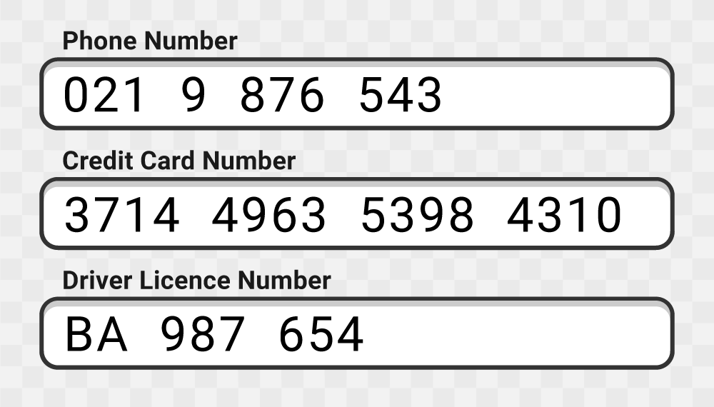
Figure 1: Numbers in a known format, well-spaced and easy to read.
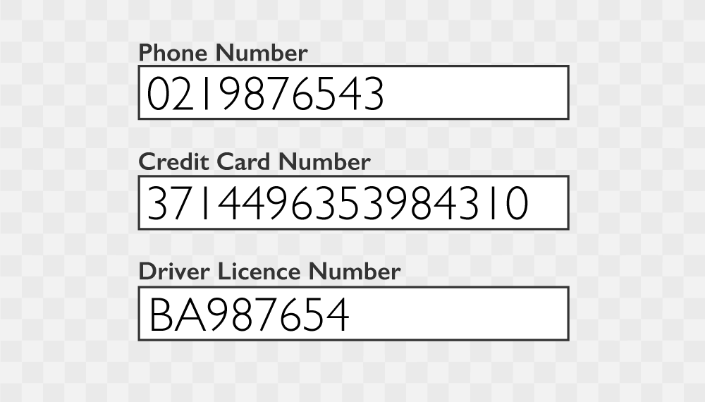
Figure 2: Poor font choice and numbers do not represent their real-world context.
The detail
Numbers create unique challenges for learners with learning differences; dyscalculia in particular (although not limited to) requires special consideration when using basic mathematical truths, and linking numbers and symbols with learning and navigating within an LMS. Form fields that require the input of numerics should be designed to display numbers clearly and simply, large number sequences, such as phone numbers, passport and credit card numbers can be split into sequential parts. The law of Prägnanz suggests our brains prefer to simplify complex visual information to prevent us from becoming overwhelmed. Naturally, phone numbers and credit cards do this already by segmenting long-chained numbers - it would be practical for any numeric input field to reproduce this real-world example. The convention of a numeric input field is often known at the design stage, this creates an opportunity to reduce user mistakes and enable success by formatting inputs to omit spaces and irrelevant characters, even auto-correct type errors before sending; for example, switching the letter “o” to the number “0” instantly after the input event.
Typography and font choice also play a major role in supporting learners with dyscalculia, and dyslexia (often found in combination). Choosing a font that minimises the occurrence of imposter alphanumeric character shapes, is essential to designing successful learning interfaces. A single string alphanumeric sequence of letters, numbers and sometimes special characters are often used as passwords, filenames or machine programming languages. A good use case example is 1Atkinson Hyperlegible, who who redesigned the zero, “0”, character from using a forward slash to backward slash to avoid any confusion with the Swedish letter oh, “O”.
Time monitoring and time-restricted sessions can be problematic when defined by numerics only. Descriptions of completion or time left displayed as days, hours and minutes present no meaning for some neurotypes. Using visual aids, such as diagrams, dots, bars and pie progress animations will help identify a number as larger or smaller.
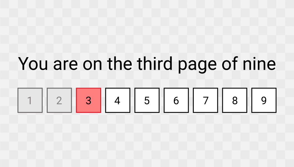
Figure 3: Visual indication of compleated pages greyed out, colour to highlight the current page and next pages numbered in sequence.
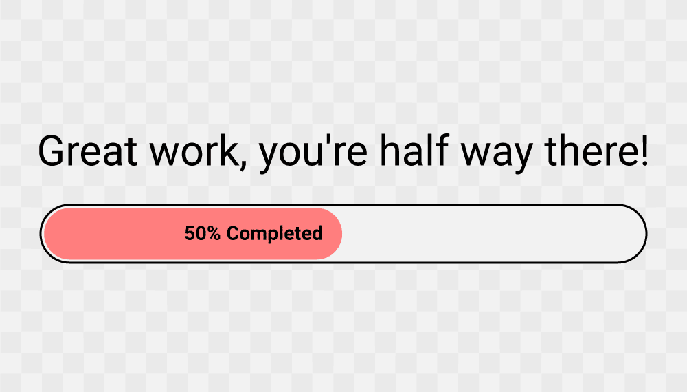
Figure 4: Typical progress bar with the addition of a written percentage indicating half completion.
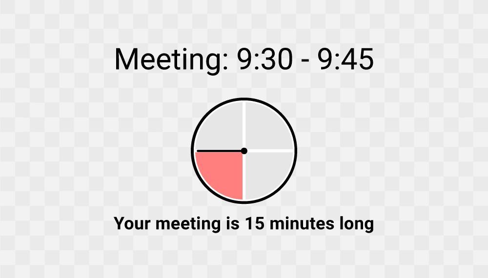
Figure 5: Analog clock graphic visualising 15 minutes as a quarter of 60 minutes.
Common mathematical concepts and patterns require additional references for a learner with dyscalculia to estimate time and numerical quantities. Combinations of numeric patterns and contextual references should consider Tesler's Law; there is a design temptation to overlook numerics in favour of an animated visual representation of time, however, oversimplifying can go beyond the point of abstraction and end up confusing learners and users.
UX Laws considered
Neurotypes considered
Further reading
Updated: 22 November 2023